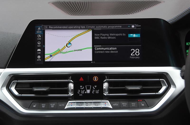
A test of 20 in-car infotainment systems has found BMW’s latest Live Cockpit Professional system to be the easiest to use.
What Car performed six tasks that drivers frequently do while on the move, including changing the temperature, zooming out on a set sat-nav route and changing from one radio station to another, with each action timed.
The research found that systems with physical buttons are much less distracting to use on the move than those that can only be altered using a touchscreen.
It took twice as long to adjust heating controls on some cars with touchscreen controls rather than physical dials. And it took up to four times longer to zoom out of the sat-nav map to view a pre-programmed route using a touchscreen than it did using a rotary dial controller.
Steve Huntingford, editor of What Car, said: “Distracted drivers are a factor in a growing number of road accidents, so it’s important to choose a car with controls that are responsive and easy to use while you drive. The best systems provide physical buttons and voice control, while those that are most distracting have sluggish touchscreens and require too many steps to carry out commands.”
Distracted driving accounted for 15% of all road accidents in 2018, compared to 13% in 2016 and 14% in 2017, according to Department for Transport data. In fatal collisions, distracted driving was a contributory factor in 25% of incidents. Every second spent looking away can be dangerous, as a vehicle moving at 30mph will travel 13.5m every second.
Researchers concluded that the best systems let you use physical buttons, the touchscreen or voice control to do a wide range of commands.
Using a sophisticated voice control system is the least distracting way of doing many tasks. The systems in the Audi, BMW and Mercedes-Benz all recognise natural speech, so drivers can activate them by talking and then ask them to carry out a desired task.
However, not all voice control systems are as intuitive or fast to respond; What Car’s testers were looking away from the road for more than twice as long in cars with the worst systems.
The most and least distracting in-car control systems:
|
1. |
BMW 3 Series with Live Cockpit Professional |
|
2. |
Mercedes-Benz CLA with 10.25in touchscreen |
|
3. |
Porsche Panamera E-Hybrid with Connect Plus and Porsche Communication Management |
|
4. |
Audi Q3 Sportback with Virtual Cockpit Plus |
|
5. |
Mazda 3 with 8.8in colour display and Mazda Connect |
|
6. |
Volkswagen Passat GTE with 8.0in Composition Media system |
|
7. |
Ford Fiesta with Sync 3 navigation and FordPass Connect |
|
8. |
Hyundai Ioniq with 10.25in touchscreen and Bluelink connectivity |
|
9. |
Vauxhall Corsa with 10.0in Multimedia Navi Pro |
|
10. |
Skoda Kamiq with 9.2in touchscreen, voice control and Amundsen sat-nav |
|
11. |
Jaguar XE with 10.0in Touch Pro Duo system |
|
12. |
Volvo S60 with Sensus |
|
13. |
Toyota Corolla with Touch 2 media system and Apple CarPlay and Android Auto |
|
14. |
Nissan Juke with Nissan Connect |
|
15. |
Honda CR-V with 7.0in touchscreen, Honda Connect and Garmin navigation |
|
16. |
Lexus RX with 12.3in multimedia display |
|
17. |
Peugeot 508 SW with 10.0in Connected 3D Navigation and voice recognition |
|
18. |
Skoda Citigo-e iV with colour screen and phone holder |
|
19. |
Fiat 500X with 7.0in touchscreen and Uconnect Live |
|
20. |
MG ZS with 8.0in touchscreen |









Edward Handley - 17/04/2020 16:08
The only surprising thing about the study results is that anyone is surprised by them. Switches, knobs and buttons can be felt, and if you are familiar with a vehicle, your hands intuitively land on the appropriate control. When functions are controlled by a touchscreen you have to look at it, and position your finger precisely over the right icon, and then watch the screen to ensure it does what you want it to - because anyone who uses a smart phone, tablet or computer knows exactly what can go wrong. Of course you have to take your eyes off the road for a lot longer. Why didn't the manufacturers realise this? They are not fools, of course they realised the problems, but touch screens let them pack in all sorts of irrelevant toys and extra functions easily and cheaply and they know the car buying public love all those extra bells and whistles. They deliberately sacrificed safety for competitive advantage. It's not the first time this has happened, and it certainly will not be the last. The manufacturers gave us keyless entry, not because we needed it, or because it was better, but because they knew the public cannot resist a fancy new gadget. Net result was they undid 20 years of improvements in vehicle security and gave the thieves the best present they had had in years! Just because something can be done does not mean that it should be done.